
Below are 50 of the coolest designed sites on the web. Take note that the following aren’t the “50 coolest designed sites.” They are just 50 “of the” coolest. A definitive list of websites would be nearly impossible.
We understand that “cool” is a subjective term. It means something different to everyone. Yet, it wasn’t the only yardstick used in selecting the following websites.
One, all the sites had to be in English. Two, we avoided big time sites like Amazon, Google, and Facebook as well as those belonging to huge companies like Nike, Pepsi, and G.E. This was not a popularity contest. We wanted sites you’ve probably never heard of before.
A site also had to be easy to navigate and comprehend. We visited a few sites with some lovely 3-D animations but we had no idea what they were selling (or even what they were trying to say).
Lastly, the site had to fit the business it belonged to. A psychotherapist is going to have a much different site than an auto mechanic. A church has different internet needs than a surfboard company. In other words, one design does not fit all.
So, if a website is in English, a little obscure, easy to navigate, complements the business, and is very cool, it was a candidate for our list.
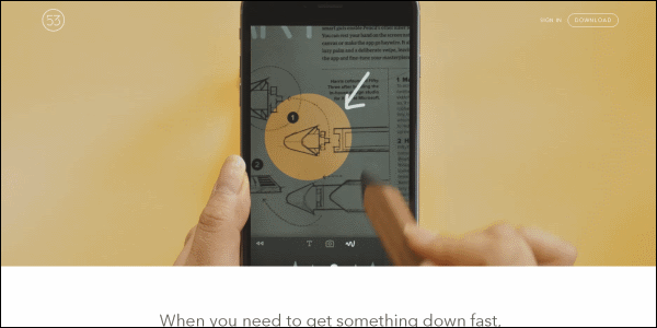
53 is a website about an app called Paper and a piece of hardware called Pencil. Click on the link to learn more about the latter. Once there you can stop clicking. Simply scroll down and you’ll learn everything you need to know about the aforementioned device. Our favorite part was the image of the hand holding the pencil. It turns as you scroll down. Consider yourself warned. This site will make you want to buy a Pencil even if you don’t need one.
Allen & Gerritsen
http://a-g.com/

Allen & Gerritsen “develop solutions” as well as excel in “real time marketing.” They have also put together a website with a really cool design (it helps that they have a picture of Roger Daltrey on their homepage). There’s a lot of information on this site but it’s presented in an easy to read fashion. You’ll never be confused.
Amazee Labs
https://www.amazeelabs.com/en

Amazee Labs has a cool logo, a cool header, and a cool blog. When you put your cursor over the “Get In Touch” graphic the surrounding border spins… both ways! The company is into web consulting, development, hosting, and maintenance. Now get this, after you’ve worked there for three years you get to take a month off to go do something extreme.
Bryan Connor
http://bryanconnor.com/

Stripes. Bryan Connor’s website, (he’s a designer and programmer) is comprised of seven stripes. Each stripe is a different color and dedicated to a different project Bryan Connor helped bring to life. The whole design is super slick and wonderfully effective.
BucketListly
http://www.bucketlistly.com/

Bucketlistly is a website where you input your bucket list and then check off accomplishments as you go. Now, we’re not going to write something corny like “visiting Bucketlistly should be on your bucket list,” but we are definitely going to write that this site has a cool design. It’s both inspiring and informative. When we visited, the trending bucket list item was “marry the love of my life.”
Café Evoke
http://cafeevoke.com/

When we think of coffee we generally think of waking up, getting buzzed, or receiving a jolt of energy. Café Evoke could have expressed those things in their website but instead they captured the essence of coffee, the delicious beverage, with sharp lines, slick fonts, pastel colors, and bright images. We love the picture of their brick and mortar store. We can’t wait to visit.
Chard Development
http://charddevelopment.com/

Chard Development’s website makes it fun to look for a place to live. The award-winning boutique real estate developer is using the internet to take the blandness out of real estate. With awesome images, great tips, and engaging news stories, Chard’s website has created a terrific resource that’s extremely user friendly. This is not your grandfather’s residential and commercial developer.
Clearleft
http://clearleft.com/
![]()
Clearleft “design[s] compelling digital experiences” and that includes their own website. Their internet presence is welcoming, enthusiastic, and colorful. They do a great job of presenting information. Don’t believe us? Just check out their “Our Work” page. While you’re at it, visit their “Who We Are” page too. Those goggles look good on you Graham.
Distance To Mars
http://www.distancetomars.com/

Distance to Mars is one of the most unique and coolest sites you’ll come across on the internet. The site is the calling card of creators David Palwoda and Jesse Williams. It demonstrates how far Mars is from Earth if the latter was 100 pixels wide. Log on as soon as you can. You have to experience the journey for yourself.
Ditto
https://www.ditto.com/

The glasses worn by the models on Ditto’s homepage automatically change. We counted. Each wears six different pairs. Ditto is a big, bold website that lets you search glasses by designer, sex, and collection. Look for the image of actor Michael Caine. He looks super cool.
Edible Schoolyard NYC
https://www.edibleschoolyardnyc.org/

Edible Schoolyard NYC is an amazing organization with an amazing website. Its homepage seamlessly and effectively blends a plethora of elements including announcements, videos, Instagram images, press mentions, statistics, and a form to join their mailing list. Without even clicking on a link you can learn everything you need to know about Edible Schoolyard NYC.
Emporium Pies
http://emporiumpies.com/

When you put your cursor over the link to “The Pies” flowers appear. Click on it and you’ll be staring directly down at seven pies. Move your cursor over a pie to learn its name and a little bit about what’s inside. To learn even more, click one more time. This is a darling little site. Information about hours, location, and pies are a snap to find. You can also order pies. We’ll take one of each.
Edsey Art
http://www.edseyart.com/

Edsey Art is an art studio. When you first arrive at their website you are greeted by a bunch of squiggles that quickly transform into a coherent and professionally drawn image. That morphs into a really cool video replete with science fiction-like sound effects. Then you’re treated to an example of a commercial storyboard, and finally examples of commercial illustrations. When you’re ready to learn more about Edsey Art go ahead and scroll down.
Envoy
https://envoy.com/

Envoy is a company that helps other companies check-in their guests and print visitor badges. They do that first part without paper. Envoy’s inviting homepage tells their story and you don’t have to bother clicking on any links (but they’re there). Our favorite elements are the “Robosaurus” and the subtle, but effective, animations.

Envy greets users with a background of moving stars that slowly transforms into something that looks like cells under a microscope. In the foreground is the sentence “We transformed _________’s idea into a successful product.” Then the blank is filled in with the name of a former client. You can click on a link to see what Envy did for them. In another part of the site, we cheered when we saw the green Pac-Man.
eWedding
http://www.ewedding.com/

eWedding allows couples to create websites about their pending nuptials. What’s cool, as soon as you arrive to eWedding you’re confronted with a link that says “start website.” Click on it and you can immediately begin designing. It’s that fast and it’s that easy. You don’t have to sign up for anything until you want to save your site. eWedding has a lot of options but selecting what you want, and finding what you need, is easier than saying “I do.”
Fit Radio
http://fitradio.com/

When you land on their homepage you’re presented with a video of a woman working out and using the Fit Radio app. When you’ve seen enough, or when the video starts to repeat, merely scroll down for more information about Fit Radio. That includes a link to their music. There’s even a link if you want to be a Fit Radio DJ. This website, like those who use it, is sleek, slim, and tight.
Green Drop Garage
http://greendropgarage.com/

Green Drop Garage is the kind of garage we dream of taking our jalopy to. They’re fun, funny, and they have beer in the fridge. They can change your oil or turn your diesel engine into a car that runs on vegetable oil. Their cool website reflects their people-, car-, and eco-friendly attitudes. It also contains lots of green design elements, black and white images, and a blog you’ll want to bookmark.
Gretchen Champoux
http://gretchenchampoux.com/

Seattle psychotherapist Gretchen Champoux’s website is exactly what you would expect from a psychotherapist. It’s idyllic, serene, and calming. When we first saw it we were ready to talk about our mothers and the loss of our first pets. This site has a lot of nice features. One of the best is the location of Champoux’s practice. It’s front and center on the homepage. It’s important to know if a potential psychotherapist is in your neighborhood or not.
Jeff Rogers
http://www.howdyjeff.com/

Jeff Rogers has done graphic design for McDonald’s, Wahlburgers, and Diet Coke. You can access his huge catalog of designs and illustrations via a group of easy to navigate menus. You can spend a considerable amount of time enjoying Rogers’ spectacular work. We highly recommend you click on the link that says “wallpaper.” It’s a feast for the eyes.
Juliana Bicycles
http://www.julianabicycles.com/en/us

Juliana Bicycles’ website is as clean and sharp as the bikes they sell (by the way, we want the Nevis model). Not only is the site appealing but it’s super easy to navigate. The two things you want most, links to the bikes for sale and how to find a dealer, are front and center. You want videos? They are there. Just scroll down.
Kite Print
http://kiteprint.com/

Kite Print is a company that prints two posters. One is a reproduction of the poster that inspired John Lennon to write “Being for the Benefit of Mr. Kite!” The other is Stephen Hawking’s invitation to time travelers. While those posters are fairly obscure (but extremely cool), Kite Print’s website does an excellent job of showing them, telling their stories, and introducing the artist. There’s a lot of text on this site but none of it feels cluttered or forced.
Lab Partners
http://lp-sf.com/

Lab Partners is a funky website belonging to a husband and wife creative team. They work with clients as well as sell posters of their own artwork. Their style is sort of 1960s kitsch meets tacky graphic design meets pop art with modern lines and hues—it’s very cool. We love how their footer and header encompass all of their content. It makes everything feel cozy.
Lavish Salon
http://lavishsalon.ca/

When you log onto Lavish Salon the first thing you’ll notice is examples of their work. There are five models—four women and one man—representing a wide range of hairstyles. The next thing you’ll notice is the image is slowly getting larger. That’s right, it’s animated. Scroll down to learn their philosophy or make an appointment. You can also examine their look book, get to know their stylists, and learn about their services. Can we get a little off the top please?
Lucy Says I Do
http://lucysaysido.com/

Lucy Says I Do to designing a cool website. The company sells fine paper products like wedding invitations. They just jump right into it too. Once you reach their homepage you can start shopping. Do you need to know more? Do you want to see their Instagram page or sign up for email alerts? No problem, just scroll down. In the meantime, you can start picking out your wedding stationary.
Made of Sundays
https://www.madeofsundays.com/

Made of Sundays is a “small wall decal and interior goodness company.” They are based in Helsinki. There are tons of images of their products. You may not know what they sell before visiting but you will once you’ll get there. We love the small touches like the ability to see prices in seven different currencies and the shopping bag icon frowns when it’s empty but smiles once you “add to cart.”
Mammoth Booth
http://www.mammothbooth.com/

The first thing you’ll see when coming to Mammoth Booth is a graphic of a remote control with a big red button that reads “fire.” Text warns the visitor not to press the button. Needless to say, we pressed the button. Nothing blew up (of course) but some photos fell onto the screen. That’s fitting since Mammoth Booth is an updated version of the classic photo booth that you can rent for your party or event. The FAQ section is especially well-crafted.

Here’s what we like about Mixd, a world class web design company, their homepage fits on your screen. Set against a green background is an image of a wheel, and to its right are the words “Beautiful Form, Perfect Function.” How cool is that? Come back again and you’ll see something similar only with a pencil, chair, or a spoon. The entire site is well-designed, but we love the “less is more” approach of their homepage.
MNAMA
http://www.mnama.org/index.html

The Minnesota chapter of the American Marketing Association is pretty cool. It’s straight-forward and uncomplicated while also being perky and informative. We especially like their events and blog pages. Speaking of their blog, it’s a place you’ll want to visit to learn more about marketing in Minnesota. And who doesn’t want to learn more about marketing in Minnesota?
Neue Yorke
http://neueyorke.com/

Neue Yorke is the website of designer and illustrator, Davy Rudolph. The site has three sections: The Work, The Journal, and The Man. The homepage is also “The Work” page. The menu is on the left. To its right are two rows of gray squares and a third row of just one gray square. Each square has a different geometric design as well as four letters. Click on the square to see examples of Rudolph’s work. The layout is basic but genius.
Our Name Is Mud
http://ournameismud.co.uk/

Our Name Is Mud cheekily boasts “Clear Digital Thinking.” That is also a great description of their website. It’s bold, crisp, and well-thought out. We like how they offer up samples of their work right there on their homepage. There’s no need to go looking for it. Just put your cursor over the image of the sample for more information.
Otter Surfboards
http://www.ottersurfboards.co.uk/

Otter Surfboards makes wooden surfboards. The vibe of their site isn’t “Cowabunga, dude. Let’s hang ten.” It’s more about the peace one finds in working with wood and the solitude of riding the waves. Images are grainy, artsy, and voyeuristic. They use muted colors and soft fonts. Best of all, they introduce us to Buddy. He’s the workshop’s dog.
Pizza Brain
http://www.pizzabrain.org/

Pizza Brain bills itself as “the world’s first pizza museum & restaurant.” Their site is super straight forward utilizing only two colors—persimmon and cream. The feature we thought was the coolest was having its menu on its homepage. Brilliant! We’re hungry. We don’t want to search for dinner. If we were giving out individual awards, Pizza Brain would win “Most Effective Site.”
Pierre’s Ice Cream Company
https://pierres.com/

Pierre’s Ice Cream Company is not only the official ice cream of the Cleveland Indians but it’s also the inspiration behind a pretty cool website. Right below the content slider are three large images that lead the user to pages about their flavors, their history, and their blog. Ice cream is pretty simple. It’s frozen, sweet, and delicious. Pierre’s website is pretty simple too only it’s cool, sweet, and ambitious.
Plant Chicago
http://plantchicago.org/

Plant Chicago wants to change the way Chicagoans “think about… food and our environment.” Maybe it’s a bit on the nose, but Plant Chicago uses a lot of green. They use it, however with aplomb. Their website is heavy on text, but presented quite well. It’s easy to follow and comprehend.
Purpose
http://www.purpose.com/

Purpose is a public benefit corporation with a website that benefits everyone. You land on an integrated video that asks more questions than it answers (in this case that’s a good thing). You scroll down and you’re hit with a grid of images. Each one is a link to a different news story. Our favorite section is the “team” page.

More than 5,300 lines of JavaScript were used to make Red’s cool website. No, we didn’t count them. Red told us. Their homepage is a grid where each square is an image or bit of text. They repeat the motif (although not exactly) in their news section and their “all work” page. By the way, ff000 is the html code for the color “red.” Our favorite color is “80FF00.”
Rooftop Cinema
https://www.rooftopcinema.com.au/

Rooftop Cinema is a site that belongs to… yes, you guessed it, a cinema that’s on a roof. The graphic that greets you on their homepage is t-shirt worthy. We’re going to say the Statue of Liberty in the image pays homage to the Planet of the Apes. The drawing that heads their blog page is nice too. This cool site will definitely inspire you to attend a flick on the rooftop.
Rosewater Market
http://rosewatermv.com/

Do not visit Rosewater Market’s website when you’re hungry. The site utilizes several images of appetizing victuals. You can experience everything their site has to offer by either clicking on a link in their header or just scrolling down their homepage. Either way, you’ll experience a svelte, well-organized, and timesaving website. There’s not a site on our list that’s a better match to their brick and mortar counterpart than rosewatermv.com.
Si Digital
http://sidigital.co/

Right below their header, Si Digital has placed the words “We create digital chemistry.” To that end, their homepage features a cool chemistry motif where pink liquid flows from a beaker down a tube (as well as down the entire page) and through the various elements that comprise, in their opinion, a successful website. One of those elements is a “Breaking Bad” themed game.
Social Driver
http://socialdriver.com/

It’s a cool effect. Behind the purple field you can barely make out an image. This faint image is also moving. On the right side of the purple field is a streak of light and a stream of business related graphics rushing to get off the screen. On the left is some text. Social Driver did a nice job of putting that effect as well as their entire site together. We really like their color scheme.
Squishy Cute Designs
http://www.squishycutedesigns.com/

Squishy Cute Designs sells soft toys, stuffed animals, and dolls. They also have a section offering free project ideas. SCD’s website is well-thought out, well-organized, and well-executed. It’s also cute as the dickens but that’s probably due to the plethora of super cute stuffed animal pictures then any html coding. The site belongs to a talented mother-daughter team but looks like it’s owned by a major retailer.
Station Four
http://www.stationfour.com/

Station Four greets you with a content slider that cycles through websites they’ve designed. As the examples change so does the background. It’s a nice touch. Little touches like that are scattered all throughout this cool site. Also, you won’t find a more colorful and vibrant blog.
Thankful Registry
https://thankfulregistry.com/

Big. Bold. Alluring. Comprehensive. Those are just some of the words you can use to describe Thankful Registry’s website. The site belongs to a company that allows users to create the biggest and best gift registry imaginable. Starting your registry is hassle-free. If you do have any questions the site provides an easy-to-use chat service. Remember, we need a gravy boat.
Tim Biskup
http://www.timbiskup.com/

Tim Biskup cheated to get on this list. Instead of going to cool web design school he went to cool artist school. His works of art are so awesome he can post them on a free blogging site and that would have made our list. Even so, Biskup’s site is nicely crafted, easy to get around, and absolutely mesmerizing.
TNL Church
http://tnl.org/

The word that first came to mind while perusing TNL Church’s website was “tranquil.” This site, with its pastel colors and images of nature, relaxes and soothes. We’re not only talking about the homepage; we’re talking about all of the sections. In case you’re keeping score TNL Church is located in Colorado.
William Leeks
http://williamleeks.com/

The picture on William Leeks’ homepage features a desk with real-life letters spelling out the designer and front-end developer’s name. There’s also a Thor figurine. Another nice touch is the coffee mug on the desk has the same logo as the navigation bar (the logo is a caricature of the designer). Leek’s strength isn’t images but simplicity. His site is hip and fresh but very straightforward.
The Wonderland Store
http://thewonderlandstore.com/

The Wonderland Store sells cool posters—mainly drawings of famous people. They sell other things too but their posters are the attraction. It’s a piece of cake to search their inventory and find what you desire (for instance the drawing of The Joker). They also have a fascinating journal section.
Zengenti
http://zengenti.com/en-gb/index.aspx

Zengenti is a content management company. No offence but that can be a little dry. Their website is anything but dry. The full screen video that greets you is so enticing it will make you want to join their organization. That’s not as farfetched as it sounds. Zengenti is hiring.
Zenman
https://www.zenman.com/

Zenman creates websites. They call websites the ultimate employees because they are the only thing working for businesses 24/7. If Zenman’s website was an actual employee she’d be bold, dynamic, and very cool. She’d also have integrated video, easy navigation, and samples of past work clearly highlighted. Our favorite part of Zenman’s website is their store. You can buy a hat or a “zenbook.”