 I believe some people create and publish bad websites for the sole purpose of tormenting their visitors. Browsing various websites and navigating the Web can often be like trying to read on an airplane while a kid kicks the back of your seat and the baby next to you alternates between screaming, crying and drooling on you.
There are some excellent websites out there to be sure, but there are also a lot of dreadful ones too. The latter are the bane of so many people’s existence, especially those who use the Web regularly. Even in 2014, there are a lot of bad sites out there.
The Net continues to grow in popularity and importance for consumers and businesses alike. Therefore, the quality of sites needs to keep pace. Creating and maintaining high-quality websites is more important now than ever. Higher quality equals more revenue. And often tech companies like Google, Facebook, SnapChat, Oracle, IBM and Intel ensure their websites are frustrating their visitors as little as possible.
The following lists the top ten ways that a website misses the boat and contributes to hair loss and nervous breakdowns. Notice the common thread that runs throughout each of these. Namely, a bad website neglects to consider the site visitor’s experience in some fundamental ways. (And if you want to learn what the best things that influence your website visitors the most, click here.) And here’s a perfect example of how to frustrate your website visitors: World’s Worst Website.
1. Animation
Seven year-olds like watching animated cartoons on Saturday morning. Business people, professionals and most other adults don’t. Sites that include showy Flash animations as an ‘Intro’, animated gifs on every page, or blinking or flying words are really annoying. They take away from the content and distract the visitor from achieving their goals. Unless your site is an entertainment site, try to avoid maddening motion. However, if your product or service can be better demonstrated using Flash, Quick Time, or other multimedia, which is common, offer your visitors the chance to click a link to view it. But don’t force them.2. Too much scrolling
Once I scroll down a full screen’s worth, my eyes start to blur, I feel slightly lost, my head spins and my interest wanes. Computer monitors really aren’t the best medium for reading. The Net and many sites are so big that it’s important to always provide a clear frame of reference for your visitors at all times while they’re on your site. If a page requires two full screens of scrolling or more, simply split it up into multiple pages.3. Long, text-heavy and blocky paragraphs of unbroken text
I really have to be into a topic or desperately need to glean the information to trudge through big chunks of unbroken text online. If I’m just shopping around for a product or service, you’ve lost me if I have to endure this kind of torture. Again, it is harder to read text on the Web than in other mediums
such as books. Additionally, Web users are notoriously impatient, so make your content easy to read and non-intimidating. Use titles, sub-titles, small paragraphs, bullets and numbering.4. No obvious ways to contact the company
If all you supply is an email on your website, your legitimacy may be questioned. Why can’t you answer the phone? Why hide behind an anonymous and cold email address? Make it easy for your existing and potential customers to talk with you.5. Unchanging or out-date content
If I start reading content on a site and soon discover that the content was written three years ago, I split. Since there’s so much information out there, my reasoning is there’s got to be comparable information online that’s more current. If you keep your content fresh your site will attract repeat visitors.
And repeat visitors are more likely to turn into customers.6. Long page downloads
It’s amazing that this is still a problem. When I click on to a site and have to sit there waiting for it to appear in my browser, I start sweating, picking my teeth, tapping my toes, rolling my eyes and soon want to throw my computer through my office window. I’m obviously a little impatient, but again, I know there are other sites out there with the same information that will download more quickly, so why wait? I’m gone.7. “Me, me, me!” instead of “You, you, you”
Generally speaking, no one cares about you, your company or your thoughts. What they do care about is what you can do for them. So sites that show pictures of the company building or tout their deep philosophy on the way business should be conducted really don’t bode well for keeping the interest of site visitors. On the other hand, sites that speak directly to potential customers about how they can solve their problems, make their lives easier,
safer, richer or more comfortable have a much better chance of keeping the eyeballs glued.8. Non-explanatory buttons or links
Here are some examples of buttons that leave me dazed and confused: A wedding site with a button called ‘Blanks’, a boating site with a button named ‘The Lighthouse’, a book site with a button called ‘The Inside Story’, or a Web design site with a button called ‘Tea Time’. They sound like Jeopardy categories. Imagine trying to find your way on a highway where its various signs read ‘Over Here’, ‘Moon Beams’, and ‘Lollypops’. Good luck
navigating your way through. It’s the same with navigating websites. Button and link names need to tell the visitor where the link leads to. Make it as easy as possible for a visitor to know where they’re going before they click. However, there are times when naming a link an ambiguous name may pique the curiosity of a user and get them to click on it. But as a general rule, keep your links and buttons as descriptive as possible.9. Inconsistent navigation
Imagine sitting down at a restaurant and the waiter comes over to you and hands you five different menus, one for the appetizers, one for the soups and salads, one for the entrees, one for the desserts, and one for the drinks. Annoying. Now imagine if each menu had a different format, layout and method for listing the items. Brutal. I really don’t want to work that hard at picking out my dinner, I’m hungry and I just want a meal. Don’t make your visitors work hard either by expecting them to re-learn your navigation system each time they enter another section of your site. They too are hungry; for useful information and they’re even more impatient.10. Inconsistent look & feel
When the look & feel completely changes from one page to another in a website, I think I am visiting another site, another company, a partner or subsidiary. I get very confused. This screams poor planning and often results from tacking on new sections later after the original site was built. This can lead to design-drift. It may be tempting to stray from the original design; you may have a better design now. But wait till you do a complete next-generation re-design of the entire site before introducing a new look & feel. If not, lots of visitors will be scratching their heads with one hand and possibly clicking away with the other.11. Popups
I can’t believe it that we’re still talking about popups, but they seem to be have a renaissance lately. Many websites have popups (or lightboxes where the rest of the screen goes dark except for the popup). And to make a user click more than they have to in order to get what they want is usually not a good idea, and this will frustrate many of your visitors.
Finally, any site that employs a number of these notorious features is particularly painful to experience. When I click to a website that has five different fonts and colors, scrolls down to the core
of the Earth, incorporates zinging words and big fat blocks of text, lists no phone number and has content written and dated in 1996, I scream and know deep down inside that pulling my fingernails out wouldn’t be as torturous as having to remain there a minute longer.
Want even more bad advice to really get under your visitors’ nails? Keep reading.
Now, if you’re a sadistic kind of webmaster or website owner and have a burning desire to royally frustrate and anger your site visitors each and every time they visit your site, these three lists are just for you. If you want to have a terrible website that looks bad, works horribly and breaks fundamental marketing rules, read on. Here are some more of the dumbest things you can do to your site.
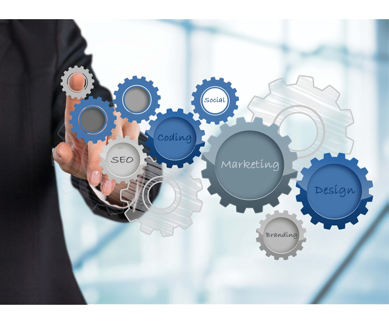
First let me explain why there are three lists. One way to look at any website is to break it up into three equally important segments; design, technical and marketing. In other words, every site on the Web contains these three components. They all have a design or look and feel (design), they all have to be on a server and coded properly to be live on the Internet (technical) and they all have ways in which they attract visitors and make sales (marketing).
So let’s look at the top ten ways in which you can annoy your website visitors and basically fail miserably at the whole website endeavor in each of these three segments. The following is a list, broken up into the three categories, defining exactly what NOT to do.
Top 10 Web Design Frustrations:
- Never using Web conventions, instead use crazy and wacky formats that no one’s ever seen and no one can understand
- Writing trite, predictable, boring or copied content only and never updating your site
- Creating totally different and unique navigation for every page so that your visitors need to waste time re-learning your navigation every time they go to a new page. Also creating totally different look & feels for every page so that your visitors never know if they’re on the same site or clicked away.
- Using buttons for your navigation only, or use complicated JavaScript drop down menus that complicate your sites navigation. Either way, if you do this and include no text links, the search engines won’t be able to spider (navigate and record) your website.
- Making your site as difficult to read as possible. Using really small fonts that are hard to read against some funky-colored background. For instance, use blue fonts on a black background.
- Using confusing, obfuscated and mysterious labels for all your links and buttons so that no one ever has any idea where they’re going if they click. The more confusing, the better.
- Making it impossible to search the site. Offering no search box, no site map and basically no possible way to find anything on your website.
- Including content that only talks about you. Never mentioning anything about your visitors or how you can help them, just talk about you and your history and all your achievements. Including a big picture of you and your office building right on the home page.
- Including only poorly-written copy with lots of grammar mistakes, and horrendous spelling and punctuation mistakes throughout your site.
- Not including any text. Making every page on your site one big picture. So for instance, on your home page have one giant picture of you and your office building and have no text so search engines can’t see your site at all.
Top 10 Technical Frustrations:
- Making your website take forever to load in people’s browsers. The longer the better.
- Making it so that your site looks completely different on everybody’s computer. So for Macs your site looks like one way, and for PCs it looks another way. Or having it look totally different in Internet Explorer, Chrome and FireFox.
- Has no form validation. Allowing visitors to enter any thing under the sun into your website forms. Maybe some smart hacker-types will enter executable code that corrupts or takes over your server.
- Making all your site visitors have to download and install lots of plug ins to view your site properly. If they don’t, too bad.
- Telling people that they have to view your site in a specific browser and browser version only.
- Making it so that any functionality on the site is confusing to figure out and works improperly and inconsistently every time it’s used.
- Including lots of broken links and missing images throughout.
- Setting it up so that it regularly crashes. For example, if more than three people are visiting the site at the same time, the home page becomes inaccessible.
- Making it so that there are tons of pop-ups, moving newsletter sign-up boxes, running videos, animations and Flash movies that take forever to download before you can view the site.
- Using lots of frames.
Top Ten E-Marketing Frustrations:
- Making your website completely bounce-friendly. In other words, make it ‘un-sticky’ so that when people arrive on one of your pages, they have no reason to stay so they leave immediately.
- Has no terms or policies page.
- Evoke no emotions. Making your site flat, boring, gray, dull and forgettable.
- Making sure there is no way for anyone who visits your site to sign up for anything or give you their contact info or email address. Certainly don’t use your site to build any kind of email list.
- Including no calls to action so that your site never asks your website visitors to do a thing. Making it so that every page is a dead end that leaves your visitors scratching their heads and then clicking away.
- Does absolutely nothing to build your brand.
- Converting absolutely no one who visits your site into a paying customer. Ever.
- Forgetting to ever use an analytics program like Google Analytics or Web Trends and never measuring or even looking at your website referrals and activity.
- Including no phone number, email and absolutely no other way to contact you. Hiding behind your website.
- Making it so that search engines can’t read your site and make it so that people can’t really read your site either.
If you do all the things above you can be confident that you’ll frustrate everyone who visits your site. If you do some (like most of us) then you still risk leaving people with an uneasy feeling when on your site and most likely hurting your chances for them to sign up for your newsletter or make a purchase.
So I think as webmasters and website owners, we all need to be very conscious of avoiding anything that makes our website visitors frustrated. The cleaner and simpler the site is, the less you make your website visitors have to think, the better.